Transforming Ambition Into Impact.
Canadian Physiotherapy Association
Brand Strategy, Stakeholder Consultation, Visual Identity, Verbal Identity, Brand Architecture, Brand Guidelines, Website Design, Launch Campaign
A Brand For A Defining Moment
For more than a century, the Canadian Physiotherapy Association (CPA) has helped shape, strengthen, and advance physiotherapy across Canada. But as the profession evolved, the Association recognized that its brand needed to evolve with it — not simply to modernize how it looked, but to better reflect who it had become and where it was going.
The CPA was entering a new chapter. With a bold strategic roadmap, an evolved membership model, and a renewed ambition to become the national home and driving force for physiotherapy knowledge and professional development in Canada, the Association needed a brand that could translate this transformation clearly and confidently.
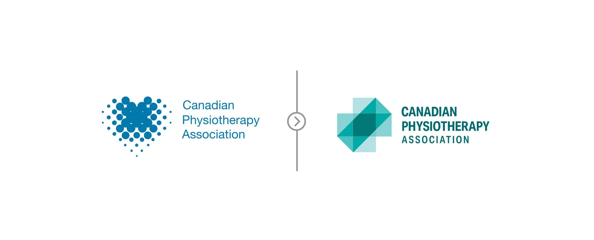
The existing identity no longer reflected the full scope, credibility, and influence of the profession. Physiotherapy had evolved into an essential, evidence-based health-care discipline, but the CPA needed a stronger way to show up — for members, partners, policymakers, health system leaders, and Canadians.
Humanity partnered with the CPA to create a renewed brand strategy, visual identity, verbal identity, branded-house architecture, and launch platform for one of the most significant transformations in the Association’s history.
The challenge was to create a brand that could honour the CPA’s history while signalling a more courageous future. It needed to unite a complex national ecosystem of Divisions, Assemblies, Provincial and Territorial Associations, volunteers, students, and professionals, while creating a stronger sense of pride and belonging among members.
Most importantly, the brand needed to help members see themselves in the future the CPA was building.
Challenge
From Professional Ambition To Collective Impact
Humanity began by grounding the rebrand in the CPA’s renewed strategic vision and the role the Association needed to play in the future of physiotherapy.
Physiotherapy professionals are ambitious, skilled, and purpose-driven. They play an essential role in helping people move, recover, adapt, and thrive. But within a changing health-care system, they also need stronger recognition, clearer pathways for growth, greater access to knowledge, and a more unified voice.
This led to a clear single-minded proposition:
The CPA transforms ambition into impact.
This became the strategic foundation for the rebrand.
The CPA’s role was not simply to represent the profession, but to help move it forward — by strengthening advocacy, expanding professional development, creating greater access to Division and Assembly expertise, supporting career growth, and building connection across the national physiotherapy community.
Strategically, the brand needed to do more than look modern. It needed to elevate the CPA as a serious health-care association, reflect the boldness of its vision, and connect beyond the profession to partners, policymakers, and Canadians. It also needed to create emotional affinity within the membership community by building a stronger sense of belonging, pride, and shared momentum.
To support that ambition, the process was collaborative from the start. The CPA and Humanity engaged members, volunteers, Division and Assembly executives, Provincial and Territorial Association leaders, and system partners through consultation and testing. The goal was not simply to create a brand for the profession, but with the profession — one that could reflect both the science and humanity of physiotherapy.
Strategy
Planes Of Motion: The Science Of Movement
The creative identity territory, Planes of Motion: The Science of Movement, translated the strategy into a visual and verbal system rooted in the science of physiotherapy.
At the core of physiotherapy is motion — studied, measured, and understood through the way the human body moves through space. The identity draws from the three anatomical planes of movement: sagittal, coronal, and transverse. Each plane represents a different dimension of human movement. When they intersect, they create structure, balance, and depth.
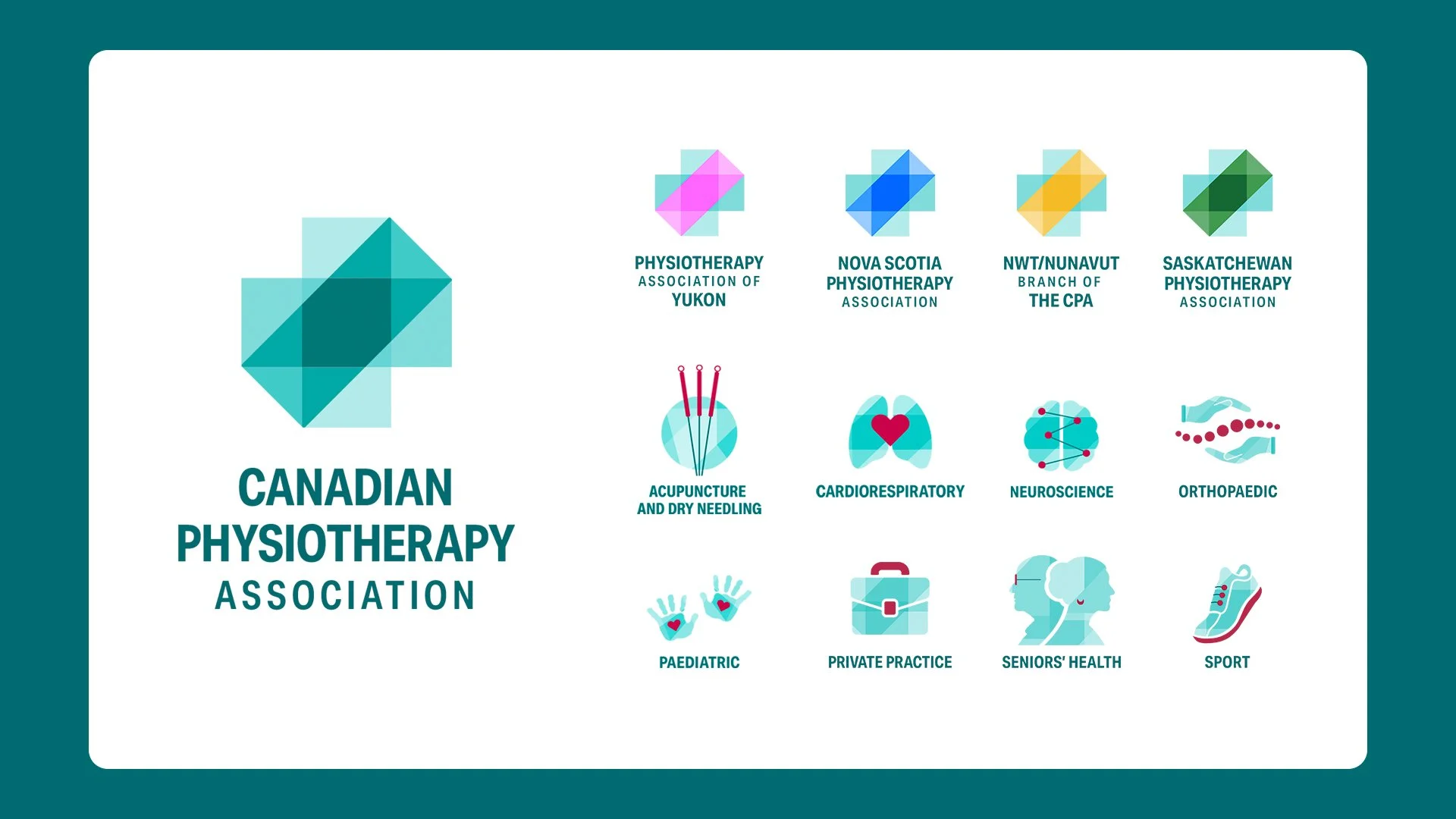
That intersection became a powerful metaphor for the CPA’s role: bringing together diverse professionals, disciplines, perspectives, Divisions, and Assemblies to advance the practice and move the profession forward.
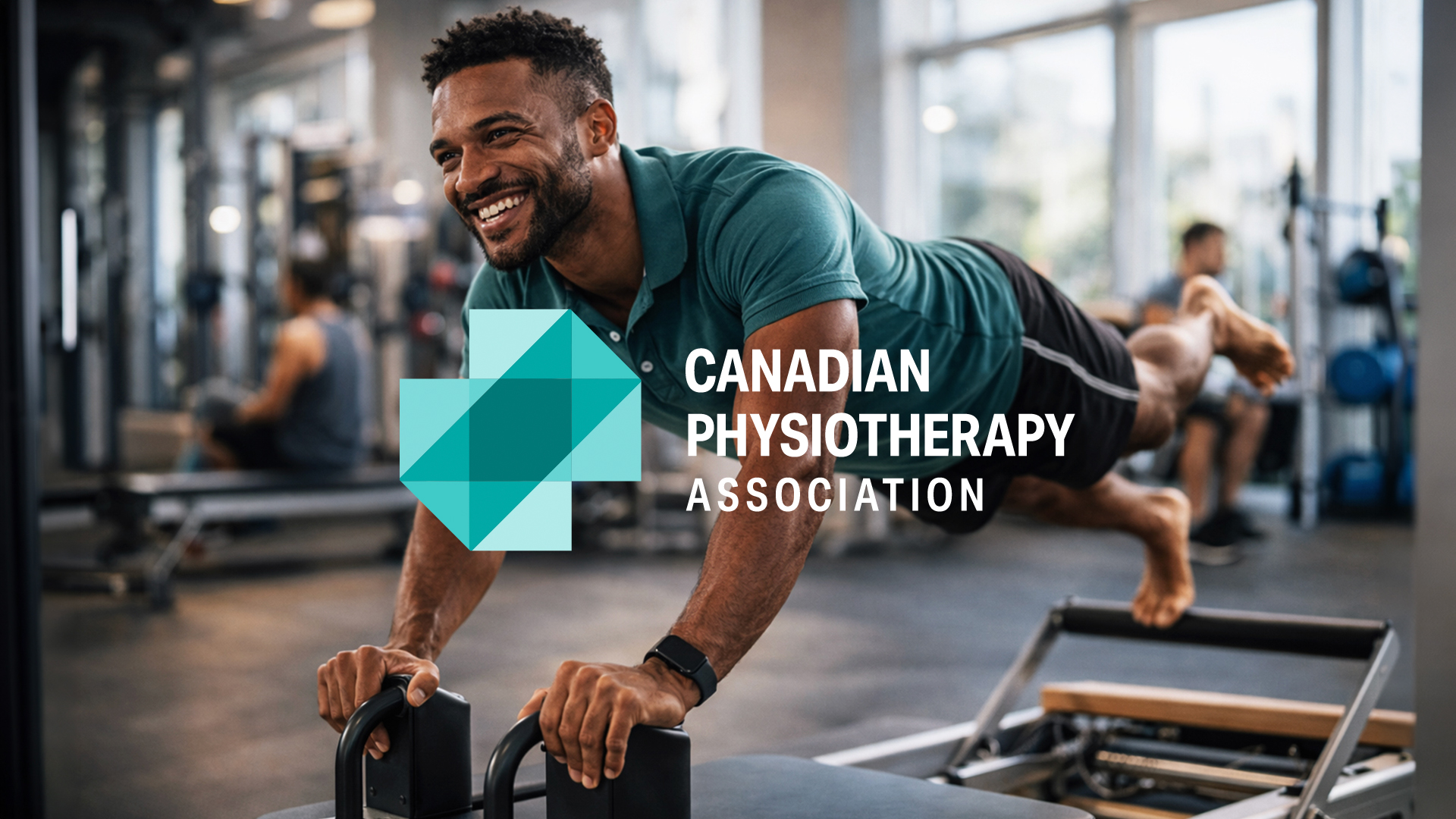
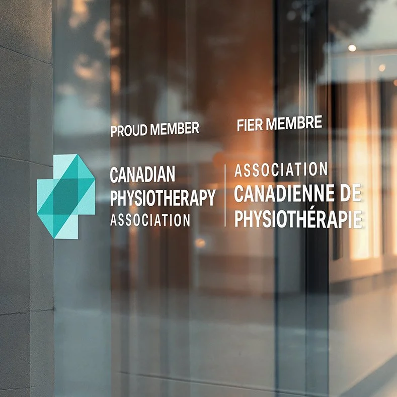
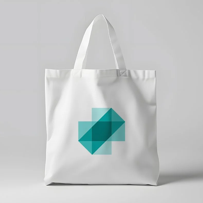
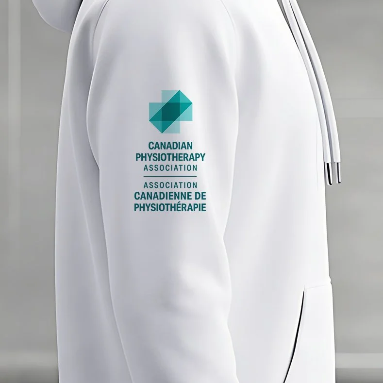
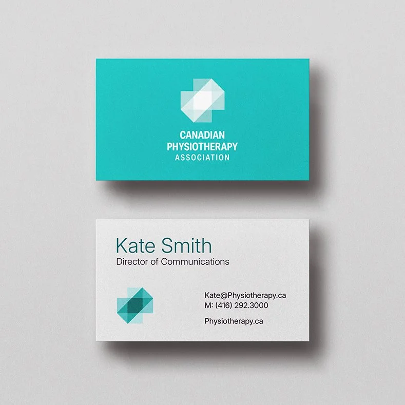
The new mark combines three core ideas: planes of motion, the universal symbol of health, and forward movement. The intersecting planes ground the identity in the scientific and clinical expertise of the profession. The cross connects the CPA to the broader health-care system. And the diagonal plane, inspired by the energy of a runner launching forward, symbolizes progress, recovery, resilience, and restored mobility.
Creative
Transparency and layering are central to the identity. Where the planes overlap, they create depth and directional flow — a visual expression of the interconnection between science and care, precision and empathy, expertise and advocacy.
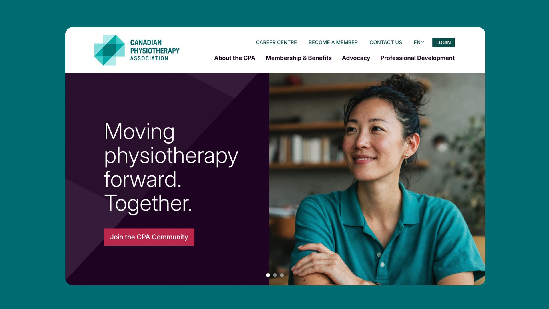
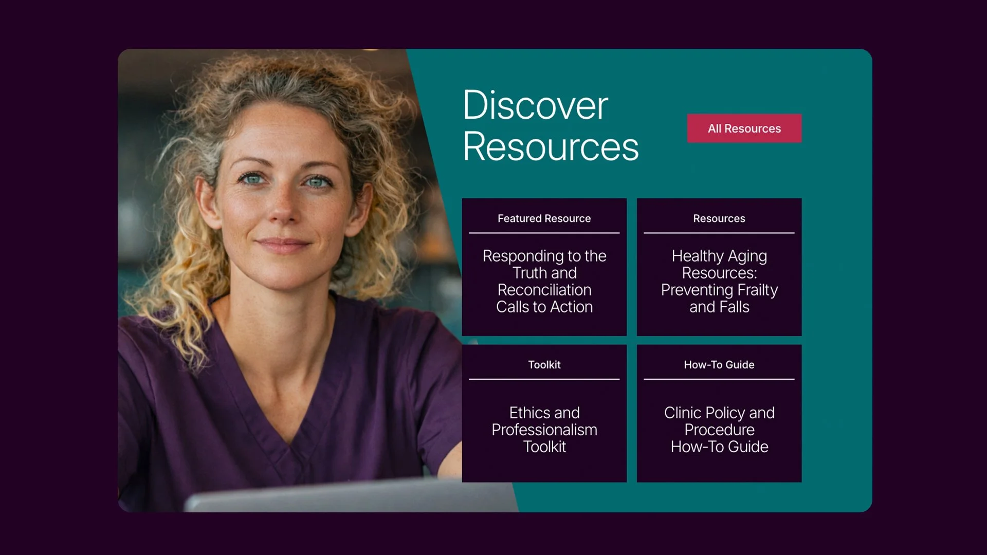
The broader visual system extends the planes beyond the logo. Angled shapes are used as graphic elements, containers, and patterns to create cohesion across communications while adding movement, structure, and dimension. The colour palette balances clinical credibility with confident expression: grounded health-care tones build trust and professionalism, while bold accent colours introduce energy, advocacy, and a spirit of courageous disruption.
Typography was selected for clarity, accessibility, and modernity, supporting a system that needs to work across digital, print, presentations, reports, social, and member communications.
The verbal identity gave the CPA a bold new voice for a bold new vision. Humanity developed the brand story, positioning, personality, tone of voice, and writing guidance to help the Association communicate with greater clarity, confidence, and consistency. The new voice reflects the CPA’s role as a courageous disruptor, evidence-based changemaker, trusted professional, and transformative collaborator — empowering the Association to speak with both authority and purpose.


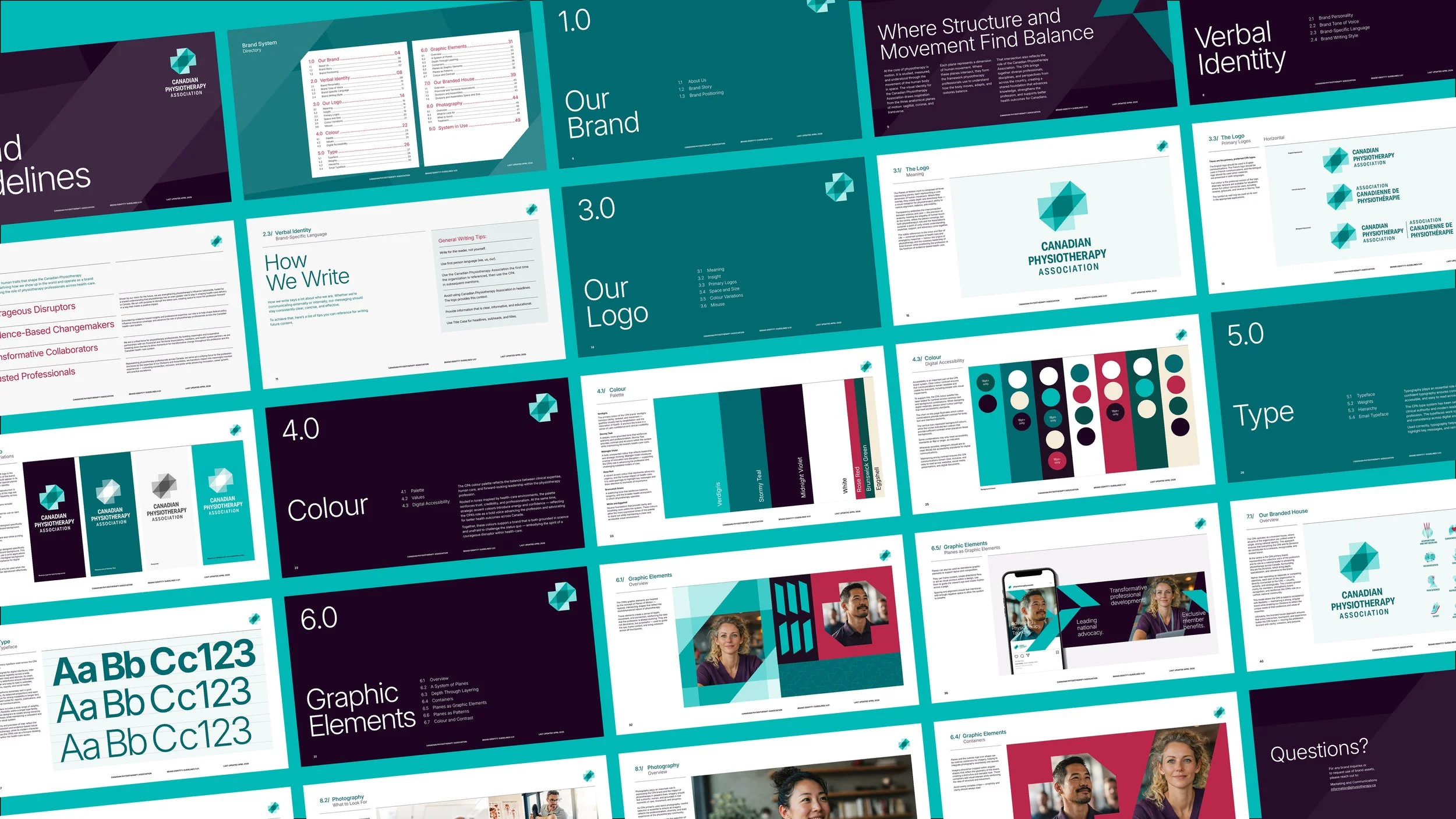

To support the CPA’s complex national ecosystem, Humanity developed a flexible branded-house system that includes participating Provincial and Territorial Associations along with CPA’s Divisions and Assemblies. Each identity is distinct, but built from the same visual and strategic language — creating one cohesive national brand with room for specialized expertise.
Launched at Congress 2026, the new CPA brand was introduced to members as an identity built with and for the profession. It marks a major moment of pride and momentum for the Association, and gives the CPA a modern brand system designed to unify the profession, strengthen recognition, and support its next era of leadership.
-
![]()
Our Health In Our Hands.
-
![]()
Informed Choices, Smarter Gambling.
-
![]()
See Life More Clearly.
-
![]()
Learning the Past, Changing the Future.
-
![]()
Accelerating Success in Ontario’s Electrical Industry.
-
![]()
Transforming Housing and Community in Calgary.
-
![]()
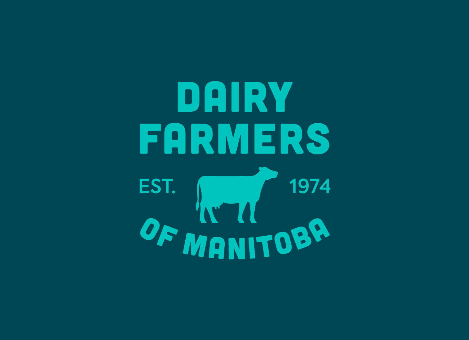
Quality and Tradition You Can Trust.
-
![]()
Empowering Youth to Take CTRL of Their Future.
-
![]()
Beyond the Beat.
-
![]()
We're invested in you.
-
![]()
Focused on you.
-
![]()
The Inspector.
-
![]()
fairlife® for your life
-
![]()
Family is the heart of dairy farming.
-
![]()
All from a good place.
-
![]()
Free to be me.
-
![]()
Transforming Frozen Food into Fine Dining.
-
![]()
Where there’s help, there’s hope.
-
![]()
Discover your roots.
-
![]()
Bigger Together.
-
![]()
A career in tech will take you there.
-
![]()
Love local. Eat local.
-
![]()
Here for Tomorrow.
-
![]()
Before it’s too late.