Reimagining
Human Rights.
Canadian Museum for Human Rights
Brand Strategy, Behavioural Science Insights, Visual Identity, Verbal Identity, Brand Guidelines, Accessible Design
The Canadian Museum for Human Rights (CMHR) is Canada’s first national museum dedicated exclusively to human rights — located in Winnipeg, Manitoba. Humanity Agency partnered with CMHR to reimagine its brand a decade after opening, shifting focus from place and architecture to the people, stories, and purpose that drive human rights education, reflection, and action.
The original CMHR brand centered on its iconic structure. But as visitor experience and programmatic depth evolved, the museum needed a brand grounded in movement and meaning — not just place. Humanity’s challenge was to translate the emotional power of human rights into a visual and verbal identity that resonates locally, nationally, and globally.
Challenge
From Place to Purpose
Humanity started with behavioral science insights and deep qualitative research to understand how language, symbols, and even sound can spark empathy, solidarity, and action. Using semiotic testing and stakeholder engagement, we uncovered two emotional drivers at the core of human rights experience: Connective (shared humanity) and Defiant (courage to act).
These dual forces shaped a refreshed brand strategy and identity system that positions CMHR as a catalyst for change — not just a cultural institution.
Key Focus Areas:
Brand Strategy & Behavioral Insights
Visual Identity & Symbolism
Verbal Identity & Strategic Messaging
Brand Guidelines & Accessible Design
Strategy
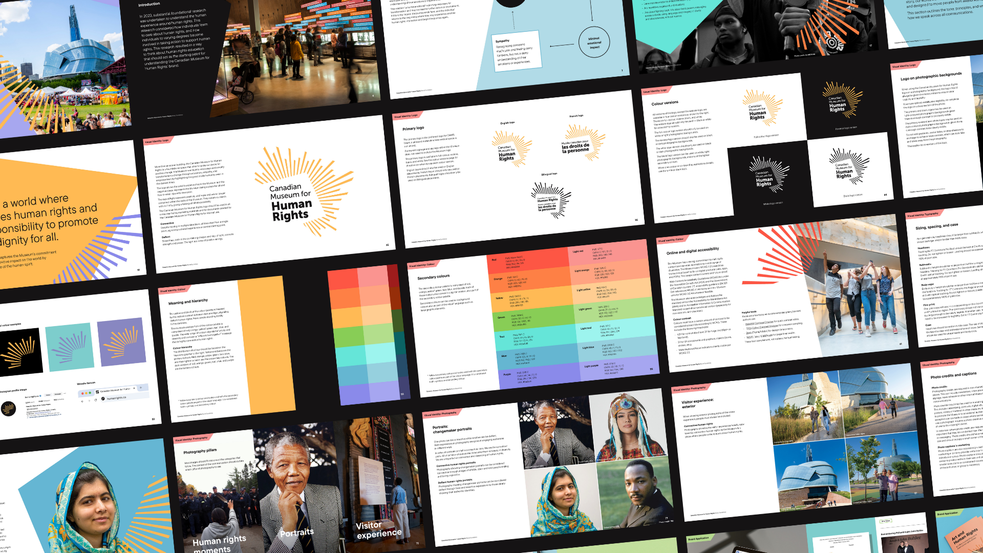
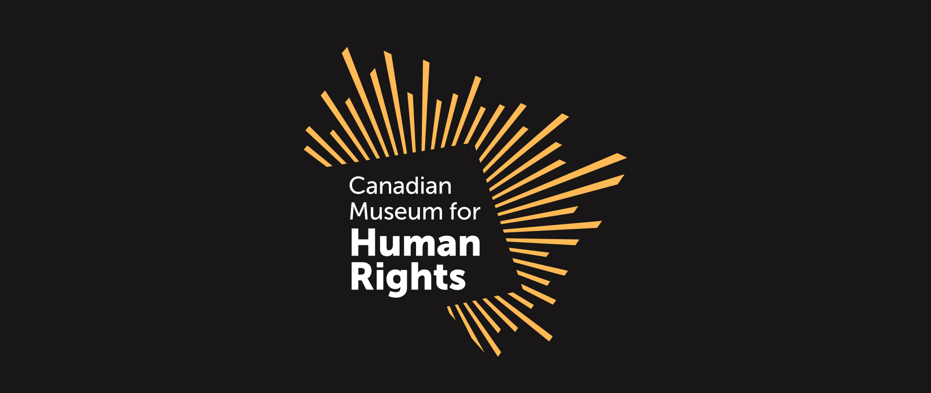
When the Canadian Museum for Human Rights first opened, its original logo was a literal reflection of its architecture — iconic and recognizable, but rooted in a moment when the Museum’s inner identity was still taking shape. It was a brand defined by place, not yet by purpose.
Ten years later, the Museum had evolved. The rebrand reflects that transformation — from a building to a catalyst for change. From a space you visit, to a movement you feel part of.
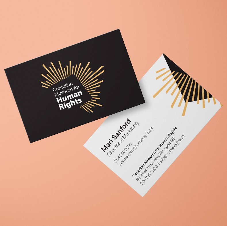
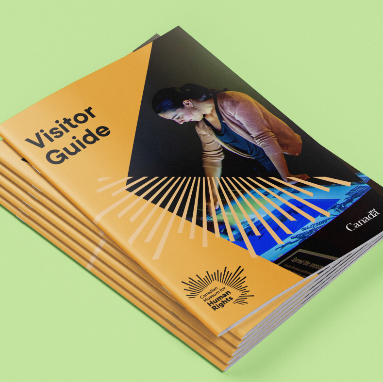
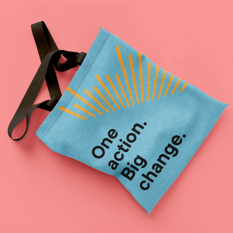
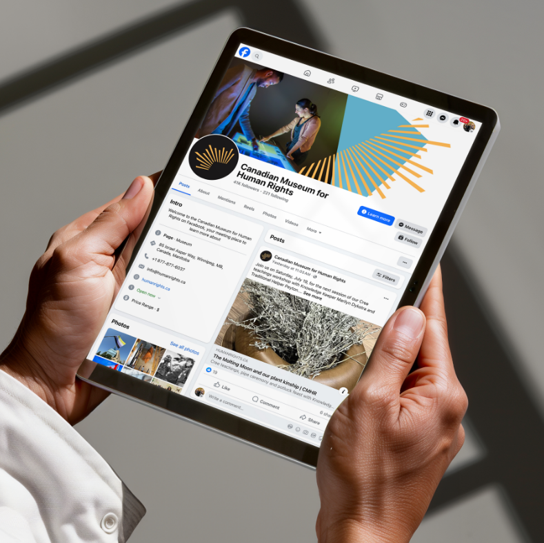
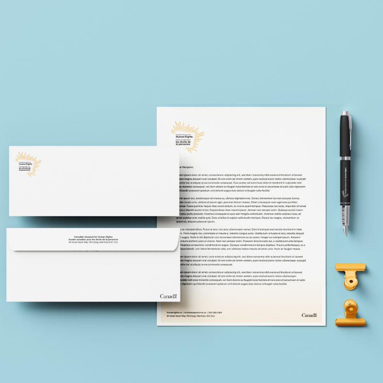
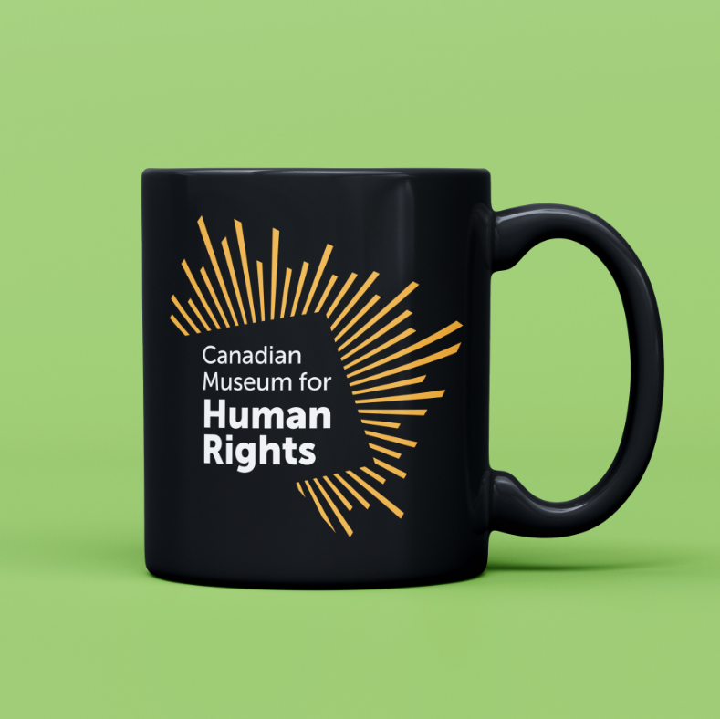
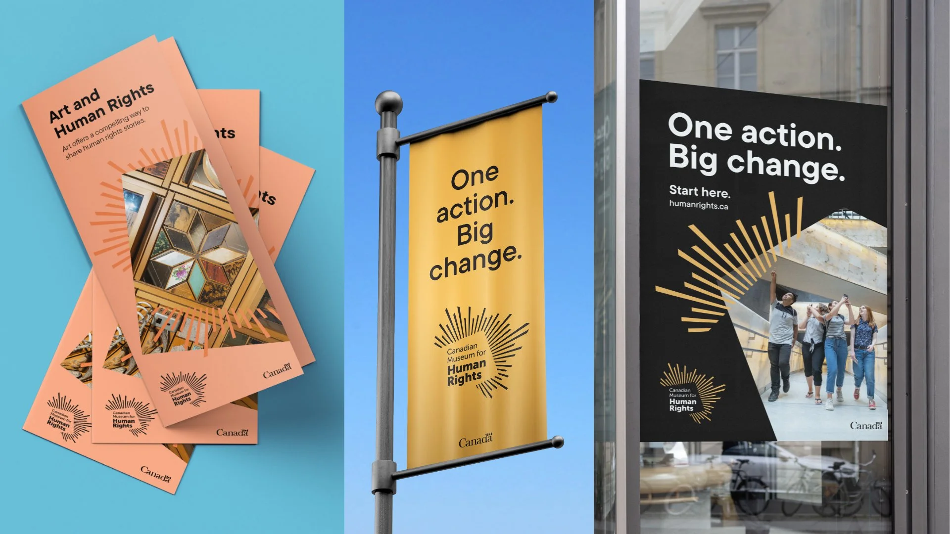
At the centre of the new identity is a logo that embodies this shift. It positions the Museum as a space where human stories spark light, even in the darkest moments. The mark symbolizes a foundation of empathy, education, and empowerment — the core of the Museum’s mission. More than a marker of place, it serves as a promise: to illuminate the human experience and inspire positive action.
Drawing directly from the building’s iconic glass and stone forms, the new identity transforms them into radiating rays of light — a visual metaphor for the Museum’s role in amplifying human rights around the world.
Each element of the logo connects back to two key semiotic themes. Defiant is expressed through the sharpness of the rays, in both positive and negative space, suggesting strength, clarity, and resilience. Light becomes symbolic of resistance — a force that shines through adversity. Connective is expressed through a single point of origin, with rays extending outward in multiple directions, representing a shared human experience and the many paths that emerge from it.
Together, these dual energies — connective and defiant — create a dynamic mark that reflects what it means to stand up for what’s right, together.
Beyond the logo, a purposeful colour system extends the Museum’s story across every touchpoint. Each hue reflects a thematic area, from Indigenous rights to sustainability, expressing both the emotional depth and global diversity of human rights.
Creative
-
![]()
Our Health In Our Hands.
-
![]()
Informed Choices, Smarter Gambling.
-
![]()
See Life More Clearly.
-
![]()
Learning the Past, Changing the Future.
-
![]()
Accelerating Success in Ontario’s Electrical Industry.
-
![]()
Transforming Housing and Community in Calgary.
-
![]()
Quality and Tradition You Can Trust.
-
![]()
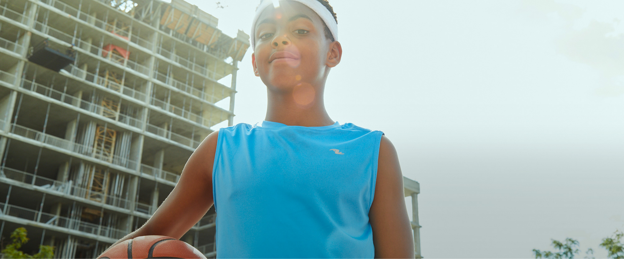
Empowering Youth to Take CTRL of Their Future.
-
![]()
Beyond the Beat.
-
![]()
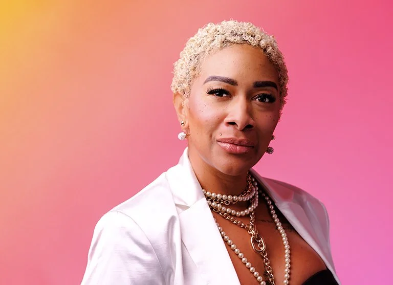
We're invested in you.
-
![]()
Focused on you.
-
![]()
The Inspector.
-
![]()
fairlife® for your life
-
![]()
Family is the heart of dairy farming.
-
![]()
All from a good place.
-
![]()
Free to be me.
-
![]()
Transforming Frozen Food into Fine Dining.
-
![]()
Where there’s help, there’s hope.
-
![]()
Discover your roots.
-
![]()
Bigger Together.
-
![]()
A career in tech will take you there.
-
![]()
Love local. Eat local.
-
![]()
Here for Tomorrow.
-
![]()
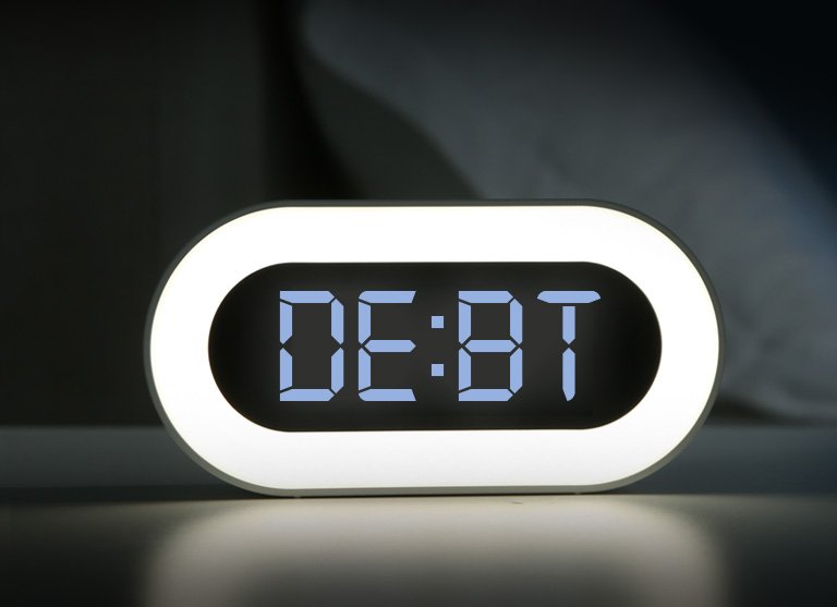
Before it’s too late.